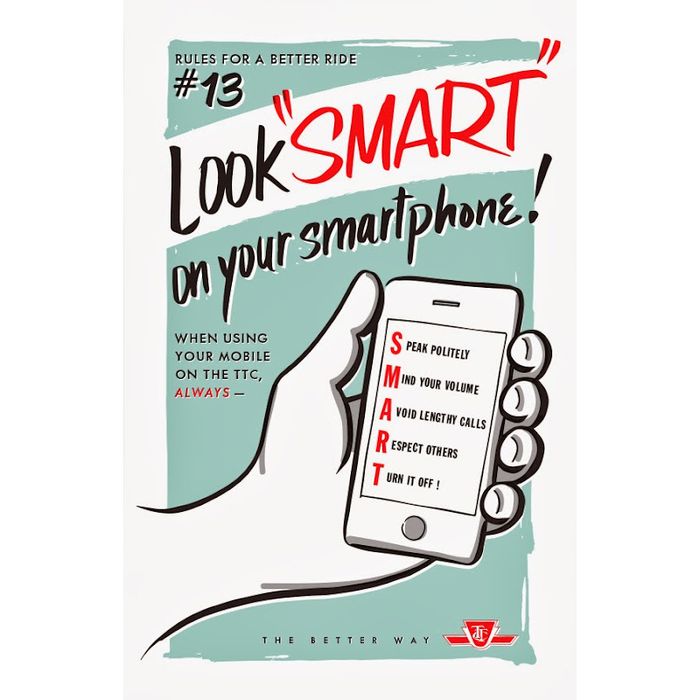
Hand-lettering
Look SMART on your smartphone!
The poster was featured in the Spring 2014 issue of Spacing Magazine. My objective was to create a playfully anachronistic poster about cell phone etiquette, had cell phones existed in the 1950s. Using a simple acronym, I present five friendly reminders for "S.M.A.R.T." phone use on the TTC. The overall style is distinctly mid-century, with its brush script lettering, sans serif typography, traditional figural illustration, muted colour scheme, and offset ink placement.
Larger version here.